Walkie Talkie App
Timeline: 4 weeks
Role: UI designer
Team: Senior product designer, Branding agency, Product owners
Overview
Walkie Talkie is a voice-based social app for people to tune in and hang out. After quick growth, the company underwent a rebrand which included a full product relaunch. In December I joined Koto as a UI designer to help implement the new brand guidelines throughout the app. The goal was to develop a more dynamic UI to further captivate the apps growing audience by creating a user experience that was aligned with the new brand identity.

Third Space
The rebrand centred around the idea of a third space. A place for people to communicate in an anonymous and friendly environment.
The app redesign brings all these goals to the surface. A new, customisable and dynamic interface with a bolder palette and modern feel brings the product up to date for its target audience.
One of the key changes included a new interactive LCD screen that features prominently within the brand world. We used this form to influence the design of other UI elements and components.


Consistency and Standards
One of the key roles I played in the design of the app was to create a robust set of components and variants. In order to support the overall brand identity, we utilised a specific shape language designed to complement the LCD screen.
By thinking atomically, we developed the component set to build out a UI kit. By doing so we were able to design more efficiently and effectively, ensuring consistency throughout the app while accounting for various states and edge cases.
These components formed the foundations of a design system that was handed over to guide the continued development of new features. This also included the comprehensive icon set and colour system developed by the brand team.


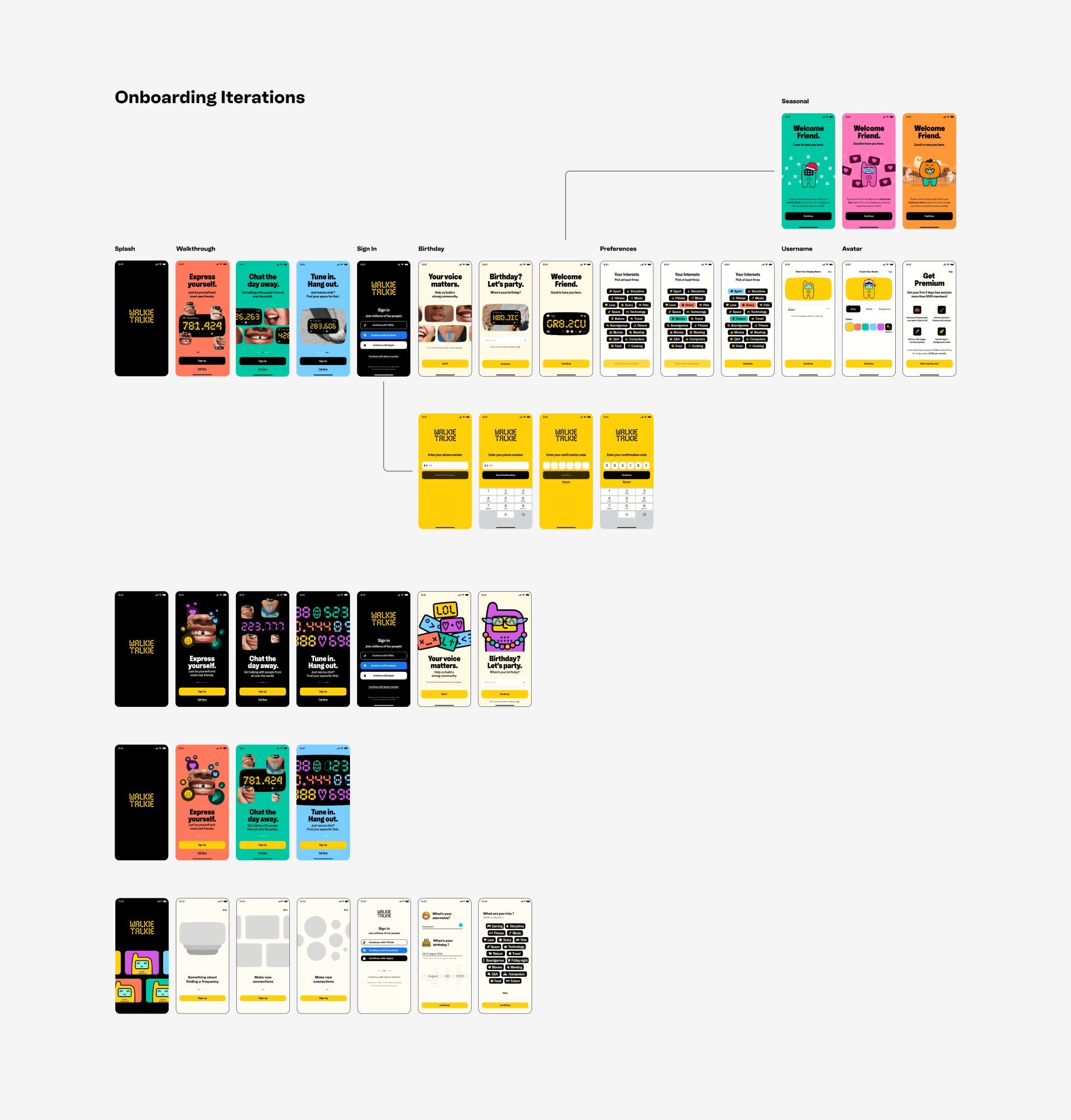
Chat the day away
We used the onboarding flow to reinforce the new brand identity, applying the art direction and style guidelines to the screens we designed.
The brand mascot features prominently in the brand world as well as the app experience. During onboarding users can customise their Talkie. This will be their avatar and a way to standout in an app that values anonymity.


Summing Up
Working on this product was a valuable experience for me as a designer. Collaborating with a senior product designer and a branding agency, I gained insights into how cross-functional teams work through the design process.
As part of the team, I had the opportunity to advocate for best practices and contribute towards a scalable design system that supports the ongoing life-cycle of the product. I also had a great experience in working collaboratively and iteratively to pursue different solutions to varied problems, based on the input of different team members.
While our role ended following the handoff to the product owners, it was satisfying to read app store reviews showing that the application is getting positive reviews for some of the new features as well as its new visual identity.
Overall, this project was a significant learning experience for me as a designer, and I look forward to applying the skills and knowledge gained to my design process when working through a more extended product design cycle as part of a team.

